
Understanding the Essence of Responsive Web Design
In today's fast-paced digital landscape, where the internet is accessed through a myriad of devices with varying screen sizes, ensuring your website looks great and functions well on all devices is not just an option—it's a necessity. Responsive web design is the approach that suggests design and development should respond to the user's behavior and environment based on screen size, platform, and orientation. This practice consists of a mix of flexible grids and layouts, images, and an intelligent use of CSS media queries. As the user switches from their laptop to iPad, the website should automatically switch to accommodate for resolution, image size, and scripting abilities.
One might wonder, why is responsive design so crucial? The answer lies in the diversity of user access points. People are no longer tied down to desktops. Smartphones, tablets, laptops, and even smartwatches have become gateways to the web. This shift demands an adaptable online presence. Websites that fail to cater to this diversity risk losing a significant portion of their audience, potentially leading to decreased traffic, lower engagement rates, and, ultimately, lost revenue. For businesses, bloggers, and creators using a free website builder, ensuring your website is responsive is the first step toward success in the digital realm.


Benefits of Responsive Design for All Websites
Responsive design isn't just a trend; it's a principle that underpins a successful digital strategy. Here are several key benefits of adopting a responsive design for your site:
- Enhanced User Experience: A responsive website offers a better user experience. Users no longer need to zoom and scroll to view content on their mobile devices, leading to higher satisfaction and increased time spent on the site.
- Improved SEO Rankings: Search engines, like Google, prioritize mobile-friendly websites in their search results. A responsive design is a key factor in SEO strategies and can help improve your site's visibility online. Explore how responsive design integrates with SEO through SEO optimization tools.
- Cost Efficiency: Maintaining separate sites for mobile and desktop users can be costly and time-consuming. A responsive design eliminates the need for multiple versions of your site, streamlining development and maintenance.
- Increased Conversion Rates: A seamless, responsive web experience can lead to higher conversion rates, whether that's more sign-ups, sales, or subscriptions. Particularly for e-commerce sites, responsiveness can significantly impact purchasing decisions. Dive into specialized responsive design options for online stores at e-commerce solutions.
Implementing Responsive Design with Free Website Builders
For those looking to build or upgrade their websites, leveraging a free website builder with responsive design capabilities is an efficient, cost-effective solution. These platforms offer a range of website templates that are pre-designed to be responsive out of the box. Whether you're creating a personal blog, launching an online business, or setting up an agency site, there's a template that meets your needs. Here's how to make the most out of your website builder's responsive design features:
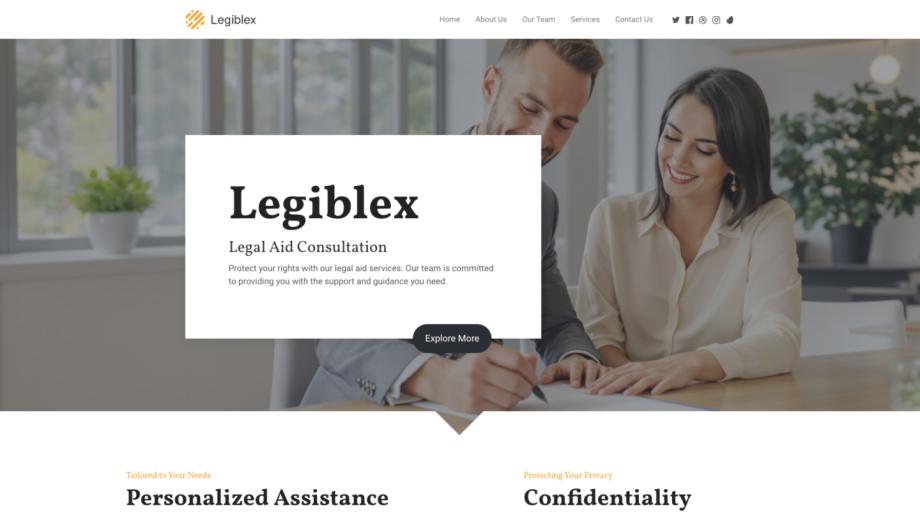
- Choose the Right Template: Start by selecting a template that not only looks good but also fits your specific needs. Templates are available for various niches, including corporate, education, restaurants, and more.
- Customize Thoughtfully: When customizing your template, keep responsiveness in mind. Test your site's appearance on different devices and adjust layouts, fonts, and images to ensure optimal viewing across all platforms.
- Test Regularly: Use the preview and testing tools provided by the website builder to see how your site looks on various devices. This step is crucial for identifying and fixing any issues that could hinder the responsive experience.
- Utilize Built-in Features: Many website builders offer features specifically designed to enhance responsiveness, such as automatic image resizing and mobile-optimized navigation. Take full advantage of these tools to improve your site's mobile usability.

The Future Is Responsive
The importance of responsive web design in today's digital age cannot be overstated. As the variety of devices used to access the web continues to grow, the need for websites that look great and function well on any screen size becomes increasingly critical. By adopting responsive design principles, leveraging the power of free website builders, and utilizing ready-made templates, businesses and individuals can ensure their online presence is optimized for both their audience and search engines.
Remember, a responsive website is not just about adjusting to different screen sizes; it's about providing a seamless, engaging user experience that keeps people coming back. Whether you're building a new site from scratch or updating an existing one, moving towards a responsive design is a step in the right direction for growth and success in the digital world.